Une matinée pour rencontrer jusqu'à 7 experts et faire le plein de conseils personnalisés.
Découvrir les prochaines dates
|
Obtenez des conseils personnalisés d'experts du digital
sur les sujets dont vous avez besoin.
sur les sujets dont vous avez besoin.
|
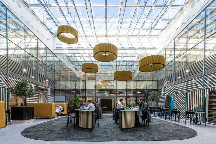
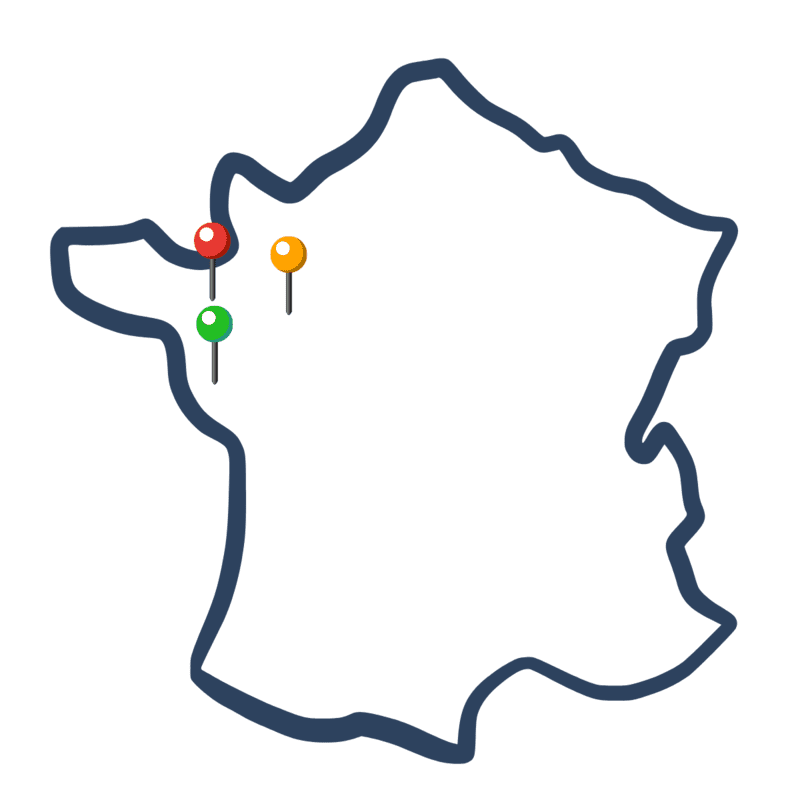
Regards d'Experts en tournée dans l'Ouest
_______________
 Jeudi 23 novembre 2023
 Roazhon Park
Nombre de places limité
|
Ils ont participé à Regards d'Experts
_______________
Une belle initiative qui permet de voir en une seule fois un certain nombre de compétences rassemblées.
Claire
De super échanges et conseils avisés donnés par des experts spécialisés.
Lauranne
Il a été très intéressant de discuter avec un expert sur des problématiques que je rencontre en entreprise.
Éloïse
|
À qui s'adresse Regards d'Experts ?
_______________
|

|
Comment s'inscrire ?
_______________
L'inscription se déroule sur la page de l'événement auquel vous souhaitez participer.
|
1
Choisissez les sujets sur lesquels vous souhaitez obtenir les conseils des experts
2
Nous vous confirmons vos créneaux de rendez-vous
3
Rendez-vous le jour de l'événement pour challenger votre stratégie digitale
|
|
|
|
|